Real estate company as purveyor of modernity.
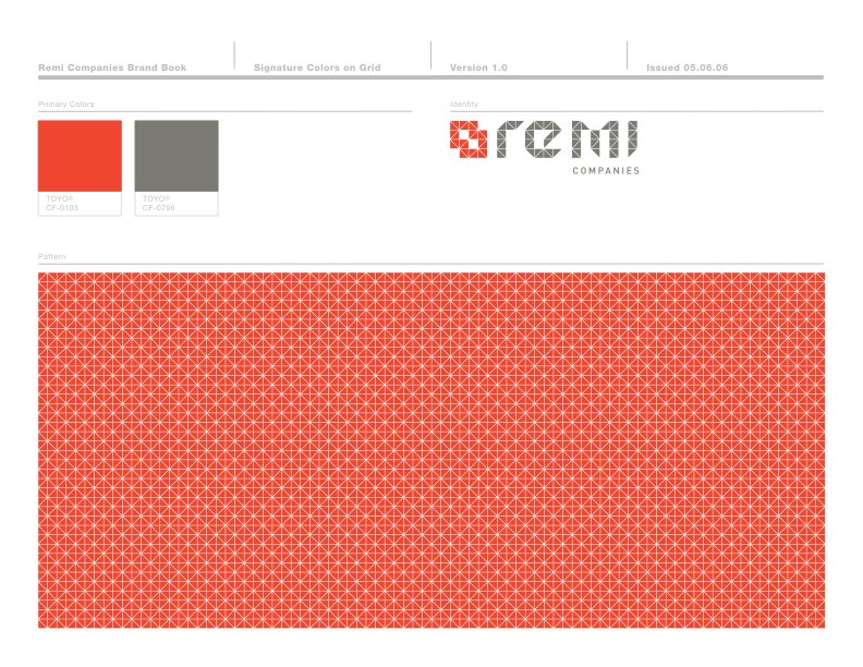
Remi Real Estate Development had quickly diversified into multiple businesses, when it approached The Apt about new branding that could better encapsulate who they had become, and where they were going. Inspired by the multi-toned bricks used for one of their projects, The Apt developed a visual identity founded on a grid of building blocks. Applied to the company name, the squares provide a modern, somewhat digital feel, which corresponds perfectly with Remi’s forward-looking ethos. Four different combinations of blocks, in primary colors, supply symbols for its four primary businesses (its the four “facades”) and interesting graphic elements to be used in collateral and marketing materials.
The Apt Scope of Work
Brand Strategy
Visual Identity
Collateral Design
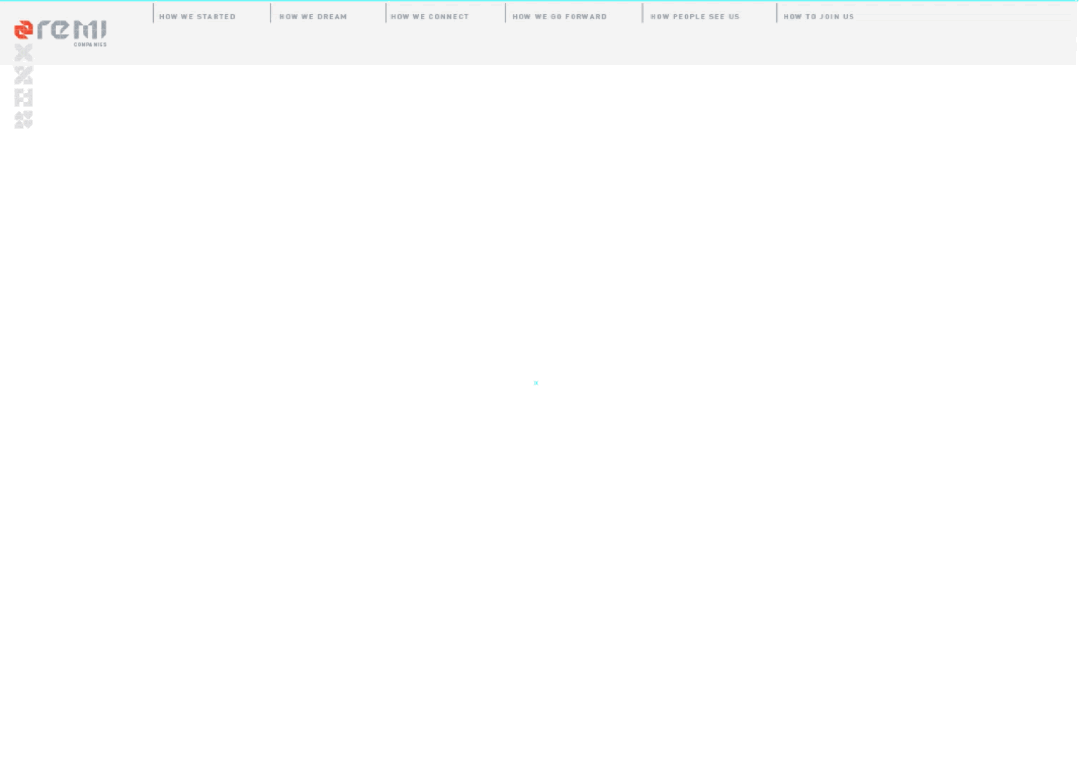
Website Development